General dentistry
Check-ups, hygiene appointments and preventive care explained in plain language.
A clean clinic homepage concept designed to help nervous patients understand services, feel reassured and make an enquiry without friction.
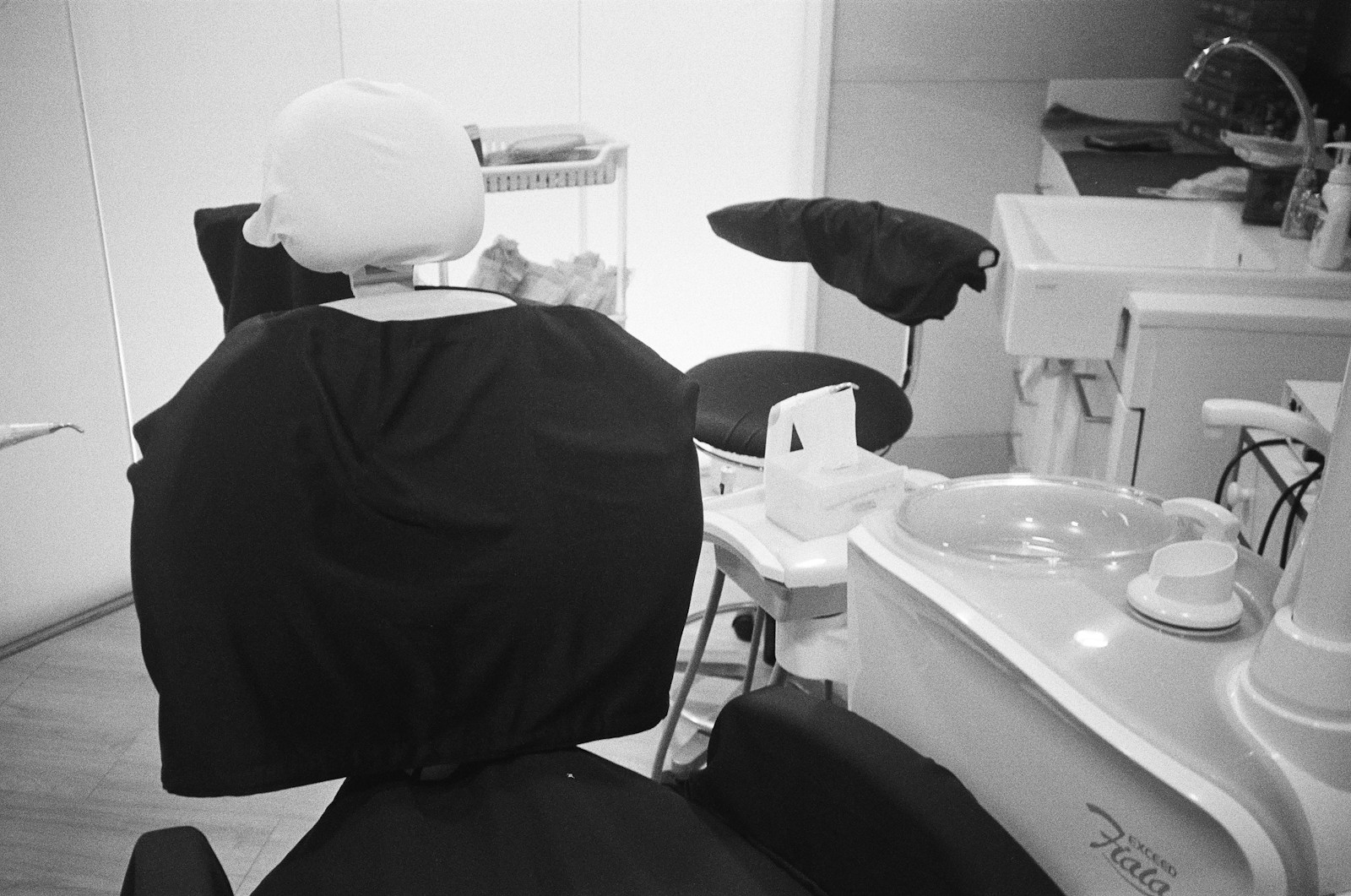
The page avoids a wall of dental terminology and turns common patient goals into clear, reassuring routes.
Check-ups, hygiene appointments and preventive care explained in plain language.
Whitening, alignment and smile planning presented carefully without exaggerated promises.
A visible route for discomfort, broken teeth and fast enquiry triage.
The visual system uses calm color, generous spacing and clear appointment paths instead of clinical coldness or hard-sell urgency.
Visitors understand what happens after they enquire.
Each treatment route has a clear purpose and next step.
The demo avoids requesting medical detail in the initial enquiry.
This fictional build demonstrates appointment-first navigation, treatment hierarchy, visible reassurance and a form that keeps sensitive information out of the first contact.
Appointment enquiry stays visible from the first screen.
White, teal and clinical blue create a premium healthcare tone.
Patients can scan before committing to contact.
No invented reviews, awards or patient stories.
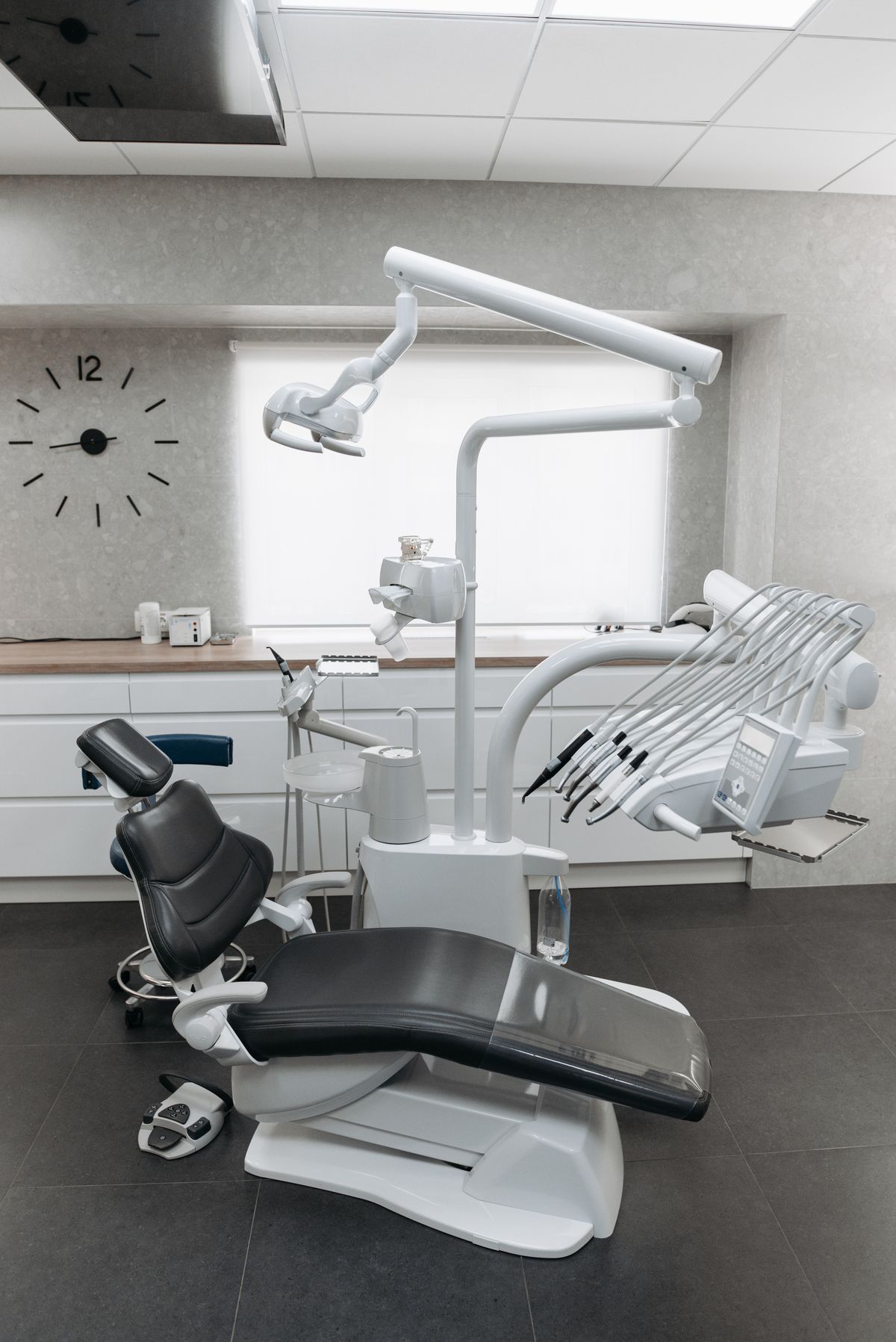
A dental site should reduce uncertainty without asking people to share sensitive health details too early.
Yes. The page gives a low-pressure enquiry route and explains that detailed medical information belongs in a proper appointment setting.
Urgent dental needs are surfaced as a clear route so visitors do not have to guess which treatment page applies.
The demo points visitors toward a simple first-step response, then fuller triage once the clinic has replied.
This demo form routes back to BrighouseSec website scope. It is illustrative and should not be used for medical information.